11 Surefire Website Conversion Best Practices for Agencies [2026]
Boost your creative agency's website conversions with 11 proven strategies—from copy to CTAs—backed by real examples and practical tips.

William Nzewi
Are you looking for website conversion best practices to grow your creative agency? You're in the right place.
Setting up an agency website is now as easy as ever. But the real challenge is getting visitors to take the desired action—signups, sales, subscriptions, trials, etc.
In this article, I'll show you 11 things you can do on your agency website to increase conversion and grow your business.
Ready? Let's go.
Why should your visitors choose you over the competition? Can you make this clear to potential clients within seconds of their landing on your page?
That's what value—proposition, the foundation of your agency’s website—is about.
Your value proposition should answer three key questions:
You can't afford to be vague here. No fluff, no jargon. Be specific, unique and straight to the point.
“We help businesses grow” won't cut it.
But something along the lines of “We help eCommerce brands increase sales by 30% through data-driven Facebook ad campaigns.” will do the job.
See how Testimonial Hero frames its value proposition.
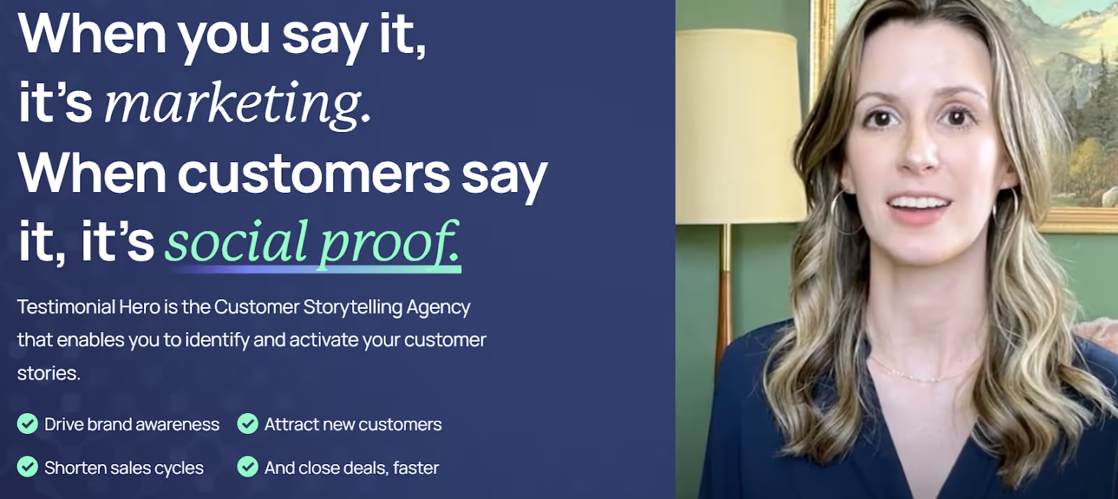
What did you notice in the examples above? It says little or nothing about the business. Rather it's all about helping the prospect.
So don't go bragging to the prospect about how you're a leading digital agency with 10 years of experience.
Why? People don't give two hoots about that. They have problems they want solved. You want their attention…and money? Put your solutions on the table.
Your agency website should be easy to use and load quickly. A confusing or slow website means lost leads and fewer conversions.
Make your website user-friendly and fast, and your visitors will:
What can you do today to make your website easy to use and fast?
You have to make your website so easy for potential clients to explore without feeling lost.
When it comes to websites, speed doesn't kill. It wins.
47% of consumers expect a web page to load in 2 seconds or less. And 40% will abandon a website that takes more than 3 seconds to load.
I didn't say so. Studies did.
So how do you make your website load faster?
Test your website speed using tools like Google PageSpeed Insights or GTmetrix. If your site is slow, fix it.
✅ Use Plenty of White Space
White space (empty space around text and images) makes your website easier to read and less cluttered. A crowded website feels overwhelming, making it hard for visitors to focus.
Keep text short and to the point. Use bullet points instead of long paragraphs. Avoid cramming too many things into one section.
Let your content breathe. It makes your site feel modern and professional.
✅ Keep Your Website Free of Clutter
A cluttered website confuses and distracts. Keep your design simple and focused.How? Remove:
Your website copy is what convinces visitors to take action. Clear and persuasive writing helps potential clients understand your services and why they should work with you.
Good copy grabs attention and makes visitors want to keep reading. It speaks to the client’s needs, focusing on their problems and solutions. It encourages action and guides visitors to book a call, request a quote or contact you.
How do you write a website copy that converts?
✅ Keep It Simple and Easy to Read
Use short sentences and paragraphs (1-3 sentences max per paragraph). Avoid big words and industry jargon. Use bullet points to break down key points. Get straight to the point—no fluff
Compare these two pieces of copy.
A. “Our agency leverages a strategic framework to develop innovative digital solutions that drive scalable business growth.”
B. “We create websites that get you more leads and sales.”
Which of them is easier to understand and more persuasive?
Your guess is as good as mine.
✅ Focus on the Client, Not Your Agency
Don't make the mistake of talking too much about yourself.
“We are an award-winning digital agency with 15 years of experience.”
Clients don’t care about your years in business unless it benefits them. They want to know how you can help them.
Speak directly to the client’s needs and pain points instead.
“Need more leads? We build ad campaigns that bring in high-quality customers fast.”
✅ Use a Conversational Tone
Your website should sound like a real person is talking, not a corporate robot. Formal writing often feels cold and people hardly resonate with it.
To sound more conversational:
Instead of “Our agency specializes in crafting bespoke marketing strategies tailored to your industry.”, write like this:
“We help businesses like yours get more sales with smart marketing strategies.”
A friendly, direct tone builds trust and keeps visitors engaged.
✅ Highlight Benefits, Not Just Features
Features tell people what your service includes. Benefits tell them why it matters to them.
Feature: “We offer custom website design.”
Benefit: “We create websites that turn visitors into paying customers.”
People want to know what’s in it for them. So connect your services to a real benefit.
Can you show potential clients proof that you can deliver results? Can your past clients vouch for you? Do you have real examples of your success?
That’s where social proof comes in. When visitors see that others trust your agency, they'll feel more confident work with you.
When making buying decisions, 92 percent of people trust recommendations from others ahead of all other traditional forms of advertising. 92 percent! Let that sink in.
So what is social proof?
Social proof is anything that shows potential clients that others have used and benefited from your services. I'm talking about…
✅ Client testimonials
Quotes from happy clients about their experience with you.
✅ Case studies
Real success stories showing how you helped a client.
✅ Statistics
Numbers that prove your impact. For example, “We helped our clients increase sales by 50%”.
✅ Industry awards or media mentions
Any public recognition of your expertise
Look at this testimonial on Workello's website made by a real person. Now look at the content of the testimonial. Notice how Alexander Heinle says exactly what Workello does for them. Notice that he also has his picture there.

Show your visitors exactly what you offer within seconds of their landing on your website. If they have to dig around to find out, they’ll leave.
✅ Make Your Services Easy to Understand
Don’t assume visitors already know what you do. Use simple and direct language to describe your services.
Use clear headlines. Each service should have its own section with a simple title.
Keep descriptions short and to the point. Avoid long, complicated explanations.
Focus on the value. Explain how your service benefits the client, not just what it does.
✅ Organize Your Services into Clear Categories
If you offer multiple services, group them into categories. This makes it easier for visitors to find what they need quickly.
For example, if you run a marketing agency, instead of listing everything randomly, break it down like this:
Web Design Services
Custom websites, e-commerce sites, landing pages
SEO and Content Marketing
Keyword research, blog writing, on-page SEO
Paid Advertising
Google Ads, Facebook Ads, retargeting campaigns
This structure makes your offerings easy to browse and understand.
✅ Show What’s Included in Each Service
Clients don’t want vague descriptions. They want to know exactly what they’re paying for.
If you offer website design, don’t just say: “We create custom websites.”
Instead, be specific.
“Our website design package includes:
✅ Be Transparent About Pricing
Pricing is one of the first things potential clients look for. There are three ways to display pricing.
✅ Fixed Pricing
If you offer set packages, list the price clearly.
Example:
Website Design Packages
Basic Website – $1,500 (Includes up to 5 pages, mobile-friendly design, basic SEO)
Premium Website – $3,500 (Includes up to 10 pages, advanced SEO, e-commerce setup)
This helps clients quickly compare options and pick what fits their budget.
✅ Price Ranges
If your pricing depends on the project, show an estimated range.
Example:
“Website design projects start at $2,000+ depending on complexity. Contact us for a custom quote.”
This gives visitors an idea of your pricing without committing to a fixed rate.
✅ Custom Quotes
If every project is unique, you can offer a free quote:
“Pricing depends on project scope. Request a free quote to get an estimate.”
Just make sure to explain how pricing is determined so visitors don’t feel lost.
✅ Offer a Pricing Comparison (If You Have Packages)
If you have different service levels, a pricing table will help visitors compare options easily.
This format removes confusion and makes decision-making easier.
✅ Answer Common Pricing Questions
Some visitors may hesitate to reach out if they’re unsure about pricing details. So add an FAQ section to address common concerns.
Look at the beginning of RocketReach's pricing page. If you scroll down the page, you notice how they listed out the features available in each price plan for easy comparison.

Can you show your visitors what you do in action? A product or service demo is one of the best ways to build trust and convince potential clients that your agency can deliver real results.
Clients are more likely to work with you if they can see how your service works before committing. They'll likely convert when they understand the value of what you offer and feel confident that you can solve their problem.
Here's what to do...
✅ Use Video to Show Your Work
If you offer web design, create a screen recording showing how your websites load quickly, look great and function smoothly.
For a marketing agency, show before-and-after campaign results, ad designs or real engagement data.
If you're in the branding space, walk through your process of creating a logo and brand identity.
✅ Create Interactive Demos (If Possible)
If your agency offers a digital product (such as a custom app or website), consider creating an interactive demo.
What are your options?
This gives potential clients a hands-on experience, making it easier for them to see your product's value.
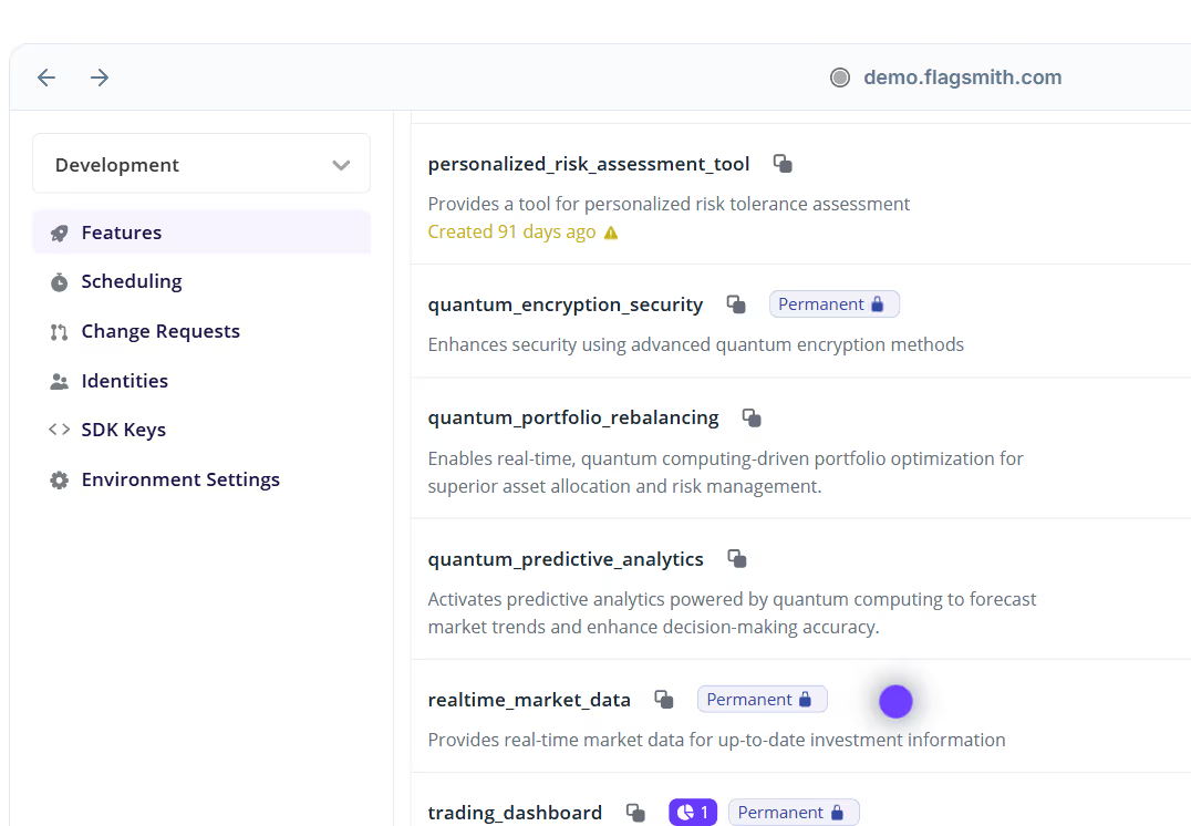
This is how Flagsmith uses an interactive product demo to introduce their product to prospects.
✅ Offer a Live Demo or Free Consultation
If your service is more complex, offer a live demo where you walk potential clients through the process in real time.
For example...
A marketing agency can show real campaign dashboards. An SEO agency can run a quick audit on the client’s website and explain the results. A branding expert can show previous client transformations in a live call.
Now, not everyone has all the time in the world to sit down and watch a full video. So consider...
✅ Using GIFs or Short Clips for Quick Demos
These catch attention fast and work well on landing pages, email marketing and social media.
Your website visitors will hardly take action unless you tell them what to do next. That’s where calls-to-action (CTAs) come in.
✅ Be Clear About What You Want Visitors to Do
Your CTA should leave no doubt about the action you want users to take. Use direct and specific language.
For example...
"Get a Free Consultation". Clear and benefit-driven.
"Start Your Free Trial". Straight to the point.
"Download the Pricing Guide". Tells the user exactly what they’ll get.
✅ Make Your CTA Stand Out
Your CTA should be easy to find and hard to ignore.
For example, if your website’s background is white, a bright blue or orange CTA button will stand out more than a grey one.
Place at least one of your CTAs above the fold (visible without scrolling). This ensures visitors see it immediately.
✅ Use Action Words That Create Urgency
CTAs work better when they create a sense of urgency and excitement. People are more likely to take action when they feel they might miss out on something valuable.
Words like “Now,” “Today,” “Limited,” and “Instant” encourage people to act quickly instead of putting it off.
Examples?
"Claim Your Free Trial Now"
"Get Your Custom Plan Today"
"Limited Spots Available—Book Your Call"
Notice how bold and contrasting (from the background) the CTA on Zapier's homepage is? Also notice how it doesn't say "Sign Up". Instead it compels you to get started for free.

✅ Match CTAs to Different Stages of the Buying Process
Not all visitors are ready to buy right away. Some are just researching, while others are ready to commit. Your CTAs should therefore match different types of visitors.
Let me give you some examples.
For new visitors (Top of the funnel)
“Download Our Free Guide” (low commitment)
“Sign Up for Our Newsletter” (stays in touch)
For interested visitors (Middle of the funnel)
“Watch a Demo” (learn more about your service)
“Get a Free Consultation” (speak with your team)
For ready-to-buy visitors (Bottom of the funnel):
“Start Your Project” (high commitment)
“Buy Now” (direct action)
Use CTAs multiple times on a page.
One CTA isn’t enough. Visitors may miss it or forget about it as they scroll. So place CTAs in multiple locations.
✅ Test and Improve Your CTAs
Not all CTAs perform the same. Sometimes, small changes in wording, color or placement can increase clicks and conversions.
So A/B test different versions of your CTA, keep track of which CTAs get the most clicks and adjust based on results.
If your form is too long or asks for too much information, people will give up and leave.
A short, simple form makes it easy for visitors to take action, whether it’s signing up for a newsletter, requesting a quote or booking a call.
Here’s how to keep your forms short and effective.
✅ Only Ask for What You Really Need
Every extra field in your form reduces the chances of someone filling it out. People don’t want to spend time typing out unnecessary details.
Don't ask for a phone number or a company name if it's not absolutely necessary.
For most lead forms, a name, email and maybe one more key detail such as project budget or company size will suffice.
Just remember…
The fewer the fields, the higher the conversion rate.
✅ Use Autofill and Dropdowns
Typing out answers takes effort. Make it easier by using...
The goal is to reduce friction and get more people to complete the form.
✅ Avoid Asking for Sensitive Information
People don’t like sharing personal or financial details unless they trust you.
Don’t ask for full addresses, credit card details or birthdates.
People don’t like long processes. If your form is short and takes 30 seconds to fill, tell them upfront.
Setting the right expectation increases completion.
Meanwhile, some people just don’t like forms. Give them another way to reach you. A chat or phone call.
This prevents you from losing potential leads who don’t want to fill out a form.
People hardly buy from businesses they don’t trust. If visitors don’t feel safe on your website or doubt your credibility, they won’t take action.
Trust signals and security features help remove doubt and give people confidence in your agency.
Here’s how to make your website feel trustworthy.
✅ Use Client Logos and Industry Badges
When potential clients see that recognized companies or industry groups trust you, they feel safer working with you.
Display logos of well-known clients you’ve worked with. If your team has industry certifications, show them. And if you're partnered with Google, Facebook or other big names, display their logos.
See how proudly Datadog displays the logos of their customers? Doesn't your trust level go up seeing the logos of Samsung, Siemens and Deloitte here?

✅ Secure Your Website with HTTPS
If your site isn’t secure, visitors might get a warning from their browser. This might scare them away.
Solution?
Use HTTPS (SSL Certificate) which protects visitors’ data and keeps your site secure. Also check for security warnings. If Google marks your site as “Not Secure,” fix it immediately.
To check if your site is secure, look at the URL bar. If there’s a padlock icon, you’re good. If not, you need to install an SSL certificate.
✅ Show Contact Information Clearly
Scam websites often hide their contact details. A real, trustworthy business flaunts theirs.
Therefore, add a phone number and email address to your website. Include a real office address. Use a live chat feature for instant communication.
✅ Display Money-Back Guarantees or Risk-Free Offers
People feel more comfortable taking action when they know they won’t lose money if things go wrong.
Here are your options...
Even if few customers ask for a refund, just having a guarantee removes hesitation from potential buyers.
✅ Use Case Studies to Prove Your Results
Trust isn’t just about security, it’s also about proof of success. Case studies show real results and help convince potential clients that you deliver on your promises.
So do you have successful past projects? Write detailed case studies about them. Include numbers and data. For example, “Increased leads by 200%”. Share screenshots and proof of results
✅ Add Privacy Policies and Terms of Service
Visitors want to know their personal data is safe. A Privacy Policy and Terms of Service show that you take data protection seriously.
Clearly link to your Privacy Policy in the footer and explain how you use customer data. Make sure your site follows GDPR or other privacy laws
Note that if you collect emails or customer details, a privacy policy is a must.
✅ Improve Website Design for Professionalism
A website that looks outdated or poorly designed can make people question your credibility.
Use a modern, clean layout and fix broken links and errors.
Your website isn’t just about words, it’s also about how you guide visitors’ attention. Strategic visual cues help direct users toward the most important parts of your website, making it easier for them to take action.
If people don’t know where to look or click, they may leave without doing anything.
What should you do?
✅ Use Arrows to Point to Key Actions
When you place an arrow near a button or form, it naturally draws the eye. Point arrows toward your CTA buttons. Use them to highlight key sections such as testimonials and case studies.
Don't overdo this, though. Else, you mess up the page.
✅ Use Faces to Create Connection
You can use images to guide visitors’ attention to important areas. People naturally look where others are looking.
Choose images where the person is looking toward your CTA. Use friendly, professional-looking faces to build trust
No generic stock photos please. They come across as fake and reduce credibility.
Use images in the testimonial section too. Adding a photo of a happy client makes the testimonial feel more real and trustworthy.
✅ Highlight Important Information with Color
If everything on your site looks the same, nothing stands out. Use contrasting colors to draw attention to important elements.
For example, use a bold color for CTA buttons. Avoid using too many colors. Stick to 2-3 colors max.
✅ Structure Pages for Natural Eye Movement
Majority of your visitors will scan websites in an “F” or “Z” pattern.
F-pattern: Users start at the top left, move across, then scan down.
Z-pattern: Users move in a “Z” shape from left to right, then diagonally down.
To make your site easy to scan...
More people browse the internet on their phones than on computers. In fact in the third quarter of 2024, around 98 percent of global users accessed the internet via mobile phones.
If your agency’s website isn’t built for small screens, you’re losing potential clients.
A bad mobile experience can frustrate visitors and make them leave before they take action.
Here’s how to make sure your site works smoothly on any device.
✅ Make Your Website Responsive
Your website should automatically adjust to different screen sizes. This is called responsive design.
If visitors have to zoom in or scroll sideways to read text, your site isn’t mobile-friendly.
You can check if your site is mobile-friendly using this tool.
✅ Use Larger, Easy-to-Read Text
Small text is hard to read on a phone. If visitors have to zoom in, they won’t stay long enough to be converted.
Use a font size of at least 16px for body text. Choose clean, simple fonts and void the fancy, hard-to-read ones.
What's more? Make sure there’s enough space between lines for readability.
Thank you for reading through. I hope you got something from this article. Now you can go and implement these strategies.
Now, converting your website visitors into clients is only one half the battle. You'll need to manage, complete and deliver their projects in time.
That's where ManyRequests comes in. ManyRequests is an all-in-one project management software built specifically for creative agencies.
It has all the features you need (including a branded client portal) to communicate with your clients and manage and deliver their projects efficiently.
Get a 14-day free trial now here.
That's it for this. See you on the next one. Bye.
Originally Posted: June 11, 2021
1. See how ManyRequests works in real life. Start a free trial and experience how productized agencies centralize requests, reduce chaos, and streamline delivery, without changing their entire workflow.
2. Read our Implementation Guide to launch smoothly with your team and clients.
3. Follow us on LinkedIn and YouTube for practical agency growth strategies
4. Check out The Productize Blueprint to learn how to turn your services into a scalable, productized offer.
William Nzewi is a data scientist and a writer. He likes to read and learn new things, especially about tech, business and life.